Hold onto your hats, crypto fam! According to CoinDesk analyst Omkar Godbole, the Bitcoin charts are screaming ‘buy!’ The MACD histogram, a key momentum indicator, has just flipped bullish, and honestly, it’s about damn time. This isn’t some flimsy little signal either – we’re talking about a potential surge to a mind-blowing $150,000 to $200,000!
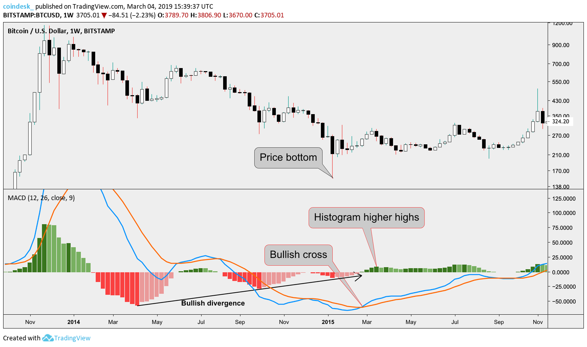
So, what the heck is the MACD histogram? Well, it essentially measures the strength and direction of price momentum. Think of it as a fingerprint of market enthusiasm. A positive shift, like we’re seeing now, suggests growing bullish pressure. It’s a pretty reliable tell, folks.
The weekly MACD chart has now cleared the zero line, providing further validation for this bullish forecast. This isn’t just a hunch, it’s data-backed optimism — and frankly, it feels good to see.
Let’s quickly break down MACD:
MACD (Moving Average Convergence Divergence) is a trend-following momentum indicator.
It shows the relationship between two moving averages of prices.
The MACD Histogram represents the difference between the MACD line and its signal line.
A positive histogram suggests increasing bullish momentum.
Its crossing above zero is often considered a buy signal, signifying potential upward price movement.
Don’t let FUD control you – the charts are hinting at a spectacular run. Get ready!